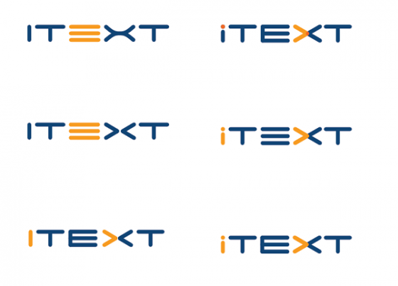
Our exciting quest for new iText logo continues and we have narrowed down our likes to one, from our first set of logo contenders. Following our previous blog post, we are showing here the next set of “would have been-s”.
Without too much deliberation, our team got fixated on the “machine-text-like” logo, for its clarity, straightforwardness and futuristic look. We are growing as a company, but we are still developers at heart. We strive to be part of the amazing developer community using iText, helping improve developer productivity with PDF generation and “future-proof” standards compliance.
With our next iteration of logos, we are looking to fine-tune the concept and use more elements that symbolize logical concepts such as three line “equivalence” sign for the “E” in iText, and inequality signs > PDF Is Dead; Long Live PDF...and Java!