The management at iText is currently writing a new business plan for 2014-2015. This isn't work done by a single person. Both internal as well as external consultants are contributing to the plan. At times, the text is confronting for me, but that was to be expected: I'm not hiring people to say the things I want to hear; I'm hiring people to say the things that need to be said.
One (minor) example of a confronting phrase involves the iText logo:
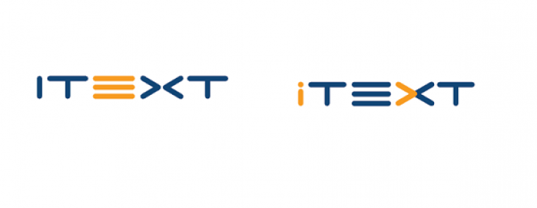
iText's graphics are inflexible, elderly and a (bit) confusing (the current iText logo is readily confused with the letter "J").
A suggestion is made "to execute an overhaul to iText's look and feel." I've gotten so used to the iText logo that I didn't question it anymore, and I'm curious to find out if and when we're going to start working on the new look and feel. It wouldn't be the first time the logo changes. Let's take a look at the history of the iText logo:
Although I'm the original developer of iText, I didn't study computer science. I graduated as a civil engineer in architecture. I was taught how to design buildings, not software. I've always admired people who were able to combine different disciplines. An example of such a person was Henri Van de Velde, an architect who also designed the logo of the Belgian railways:
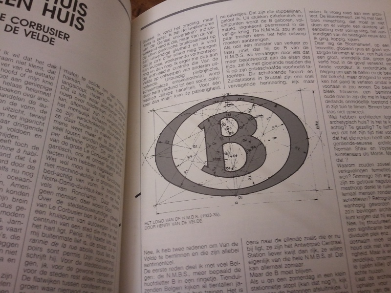
This logo was designed in 1933-1935, and it's still used today. I read this article in the magazine "Kunst & Cultuur" in 1987 and I never forgot about it. I thought about it recently, when I rediscovered a funny link about the past and the future of famous logos and I wondered: do I still have the drafts I made when I designed the iText logo? When did I create the first logo?
Thanks to the Way Back Machine, I was able to find an approximate answer to the second question. In August 2003, my site looked like this:
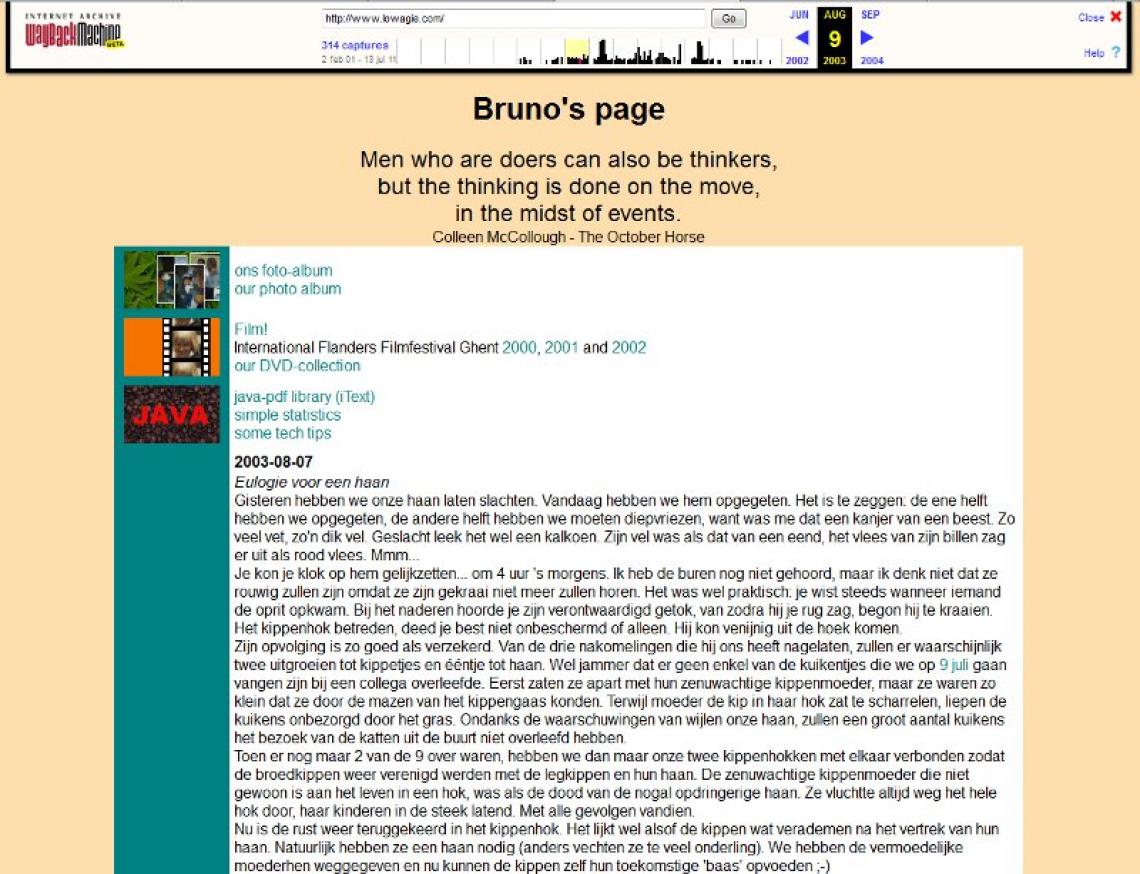
There was a "JAVA" button with coffee beans in the background, and that's it. Mind the slogan I used back then:
Men who are doers can also be thinkers,
but the thinking is done on the move,
in the midst of events.
It's a quote about Caesar by Colleen McCollough in her Masters of Rome series. I had forgotten all about that quote, but I'll use it the next time I need to do a talk about iText and iText business, because it really defines what I've been doing in the past few years.
The next screen shot found in the archives of the Way Back Machine, dates from October 2003. The coffee beans are replaced by the first iText logo:
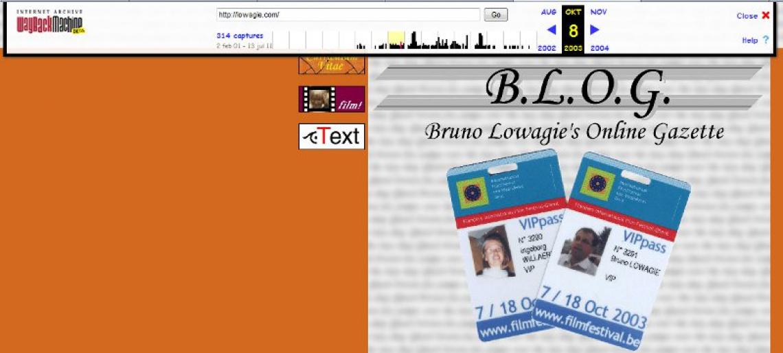
I guess I must have designed that logo somewhere between August 9 and October 8. I remember that I made a drawing on one page, but I don't remember if I kept that page somewhere. Maybe some one, some day will find it in my archives.
In any case, this is what the first iText logo looked like:
![]()
It's not a very fancy logo. I didn't really spent much time on it. I was frustrated by the fact that people pronounced iText as ee-text (that's how you'd pronounce it in Dutch or French) instead of as eye-text (that's how you pronounce it in English). I thought it would help if I replaced the letter i by an abstract symbol that looks like an eye. I made one drawing, and then I started coding: the symbol is made entirely using Bézier curves (see chapter 14 of iText in Action if you want to find out more).
This rather simple and not so attractive logo has been used for over four years, but then came the plans to start up a company for iText. If we went pro, we really needed a better logo. I was still under the impression that, being an architect, I was capable of doing everything on my own. So I started drawing somewhere in November 2007: ![]()
Note that this page was originally a TODO page (I've removed references to the people I had to meet). Apparently, I also had to contact SUN for something, and I drew their logo next to their name. Why? Because I like a logo that is a stylized representation of the name of the company. I wanted to visualize the company name 1T3XT as "I heart iText":
![]()
I soon dropped the strict triangular structure, in favor of a more fluent typography.
![]()
I wanted a logo I could write down as a signature:
![]()
Once I had made up my mind, I again defined the logo as a series Bézier curves. In January 2008, we founded the company 1T3XT using this logo:

I must admit that the logo wasn't a success. The response was very negative. People didn't recognize the heart. All in all, it was too complex, so after a while it was reduced to a much simpler symbol:
![]()
I still use the "long version" of the logo for 1T3XT (2008), but for the newer iText Software companies, ISB in Belgium (2011) and ISC in California (2009), I've used the "short version" of the logo.
In any case, the current logo of iText is about 6 years old. Maybe it is time to consider a new logo that was created in a somewhat more professional way.